Tuesday, May 4, 2010
B-Side wins again (Happy 73rd Birthday, Dick Dale!!)
If you can explain to me how a song this awesome could have been relegated to the B-side of a single, I'll owe you one.


Tuesday, April 27, 2010
Everything is relative (or, at least, color symbolism sure is)
Courtesy of Information Is Beautiful comes this amazing diagram(?) of the different meanings colors have various cultures around the world.

Click the link I gave above (or click it here if you demand instant gratification) to see a much larger, more legible version of the image. It's the final cover design for the book Information is Beautiful by David McLandess, which you can buy with this cover in the UK or with an inferior cover and title but the same text inside in the US.
Click the link I gave above (or click it here if you demand instant gratification) to see a much larger, more legible version of the image. It's the final cover design for the book Information is Beautiful by David McLandess, which you can buy with this cover in the UK or with an inferior cover and title but the same text inside in the US.
Tuesday, April 20, 2010
RIP: Keith "Guru" Elam (1966-2010)

43 years old. Hard to believe that Guru was able to get as much done for hip hop (and, let's be fair, for the popularization of jazz among Gen-X-and-younger African-Americans) as he did in such a short life.
Embedding on this blog doesn't work all that well. Here's a video of "Mass Appeal", my favorite Gang Starr track (or, well, one of the two or three dozen of my favorite Gang Starr tracks - I might have picked a totally different one if I'd posted this tomorrow). Click it and thrill to the man's voice. His rhymes were always good, but it was his voice that he'll be remembered for most.
RIP
Monday, April 12, 2010
My first experience with "Outsider Art"
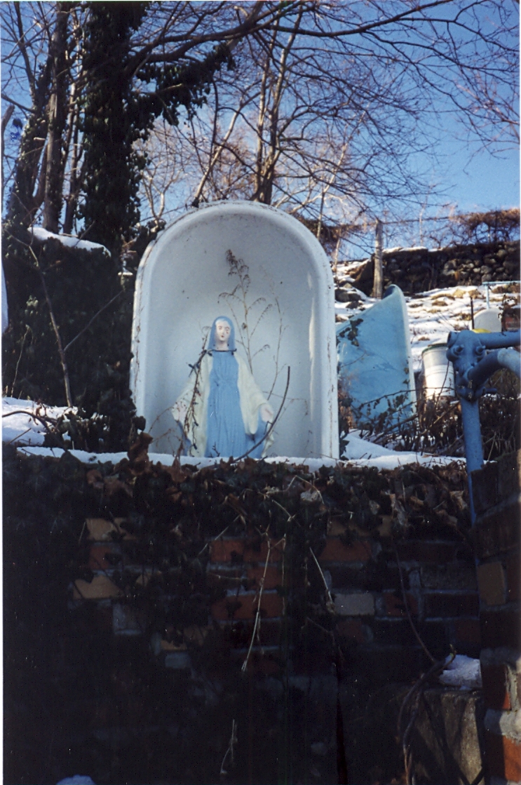
Photos (circa winter 98-99) for this blog entry supplied by Jana Savanapridi of the Thunderfakers. Check out her music!
If I recall correctly, I first heard the term "outsider art" sometime in the early or mid-90s, while I was at Pratt Institute studying painting (and trying my damnedest to always be aware of "The Newest And Weirdest Shit"). It was likely around the time I first really studied Jean Debuffet -- he pretty much created the art-critical concept by coining the term "Art Brut" to describe artwork made by the institutionalized insane.
The term "Outsider Art" is essentially an Anglicization of "Art Brut," though in some people's minds it refers not only to the institutionalized but to anyone whose artwork exists outside of the standard studio-to-gallery-to-museum-with-a-general-knowledge-of-what's-going-on-in-art-history mode. That is to say, it's naive, and often a bit 'visionary' (much as I tend to avoid that term).
Aaaanyhow, when I first heard the term and had it explained to me, my reaction was "Oh. Like the Sanctuary of Love."
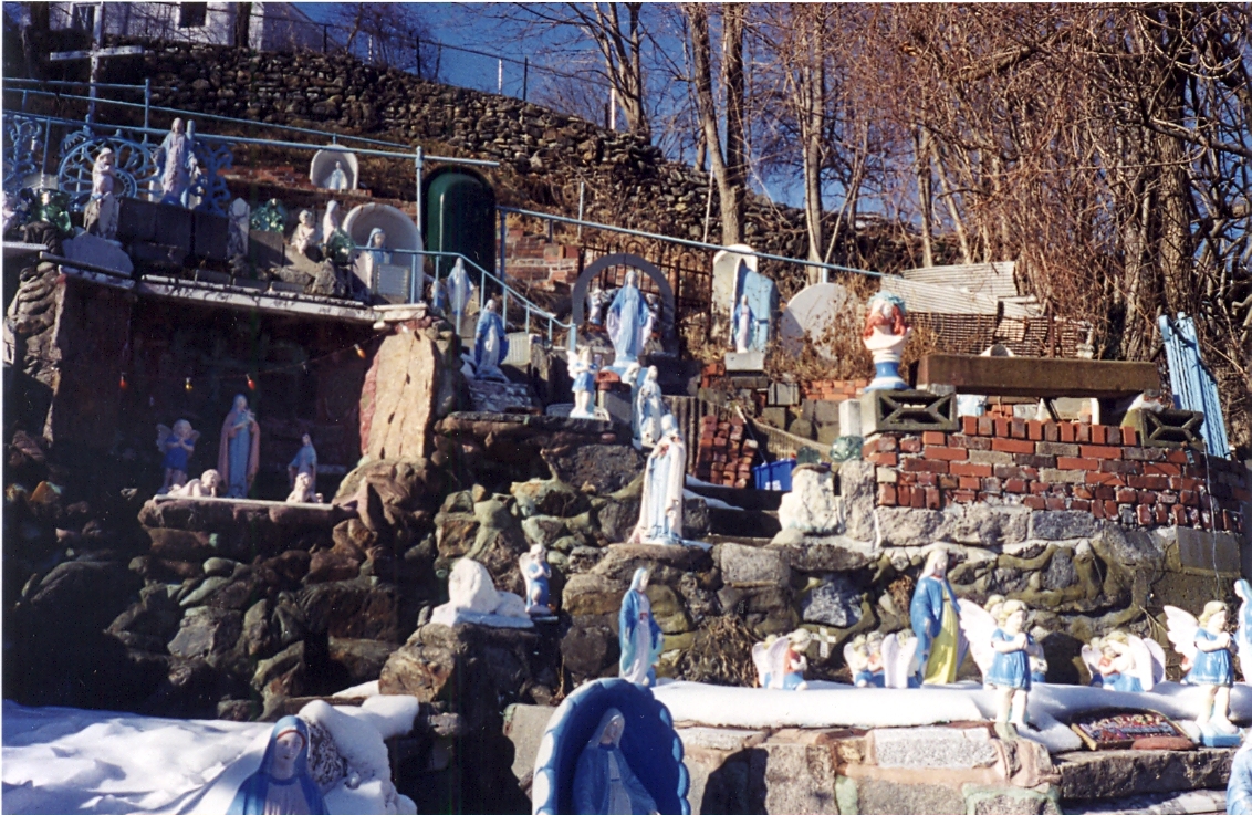
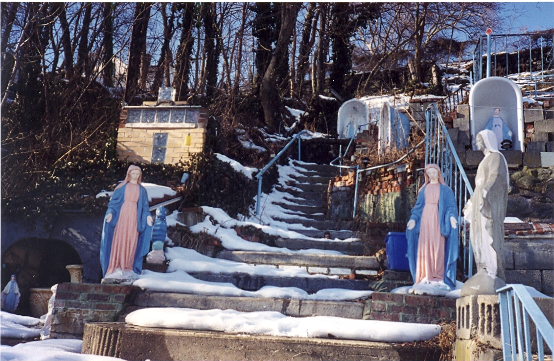
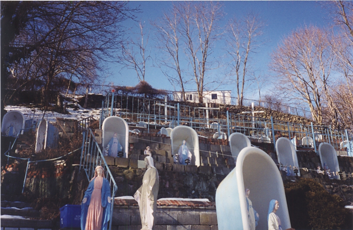
By "building," Sal meant decorating the steep incline of his building's backyard with forty-seven upturned clawfooted bathtubs, each home to a concrete statue of the Virgin Mary (he poured the concrete himself). Eventually, painted concrete seahorses and butterflies filled the yard as well. Three large wooden crosses stood near a stone wall carved with the Ten Commandments. The steps on the hill were filled with mosaics -- psalms and calls to prayer, a version of the Sea of Glass from the Book of Revelation, made of old broken glass from a nearby Thermos factory -- and eventually a lovely sign was posted on the steps leading up to the yard, reading, simply:
"WELCOME TO THE SANCTUARY OF LOVE. Your Faith Has Brought You Here."

The Sanctuary had a long run as a destination for the sort of Catholic who makes visits to shrines devoted to the Virgin of Guadalupe (or any statue that weeps blood, of course). In the 90s and early '00s, it became a place for those who'd lost money at the nearby casinoes to pray for luck at gambling (or for help after losing too much money). Sal never charged admission, and let needy people stay on the property for free, though there was a bucket in the back yard that people often dropped coins into.
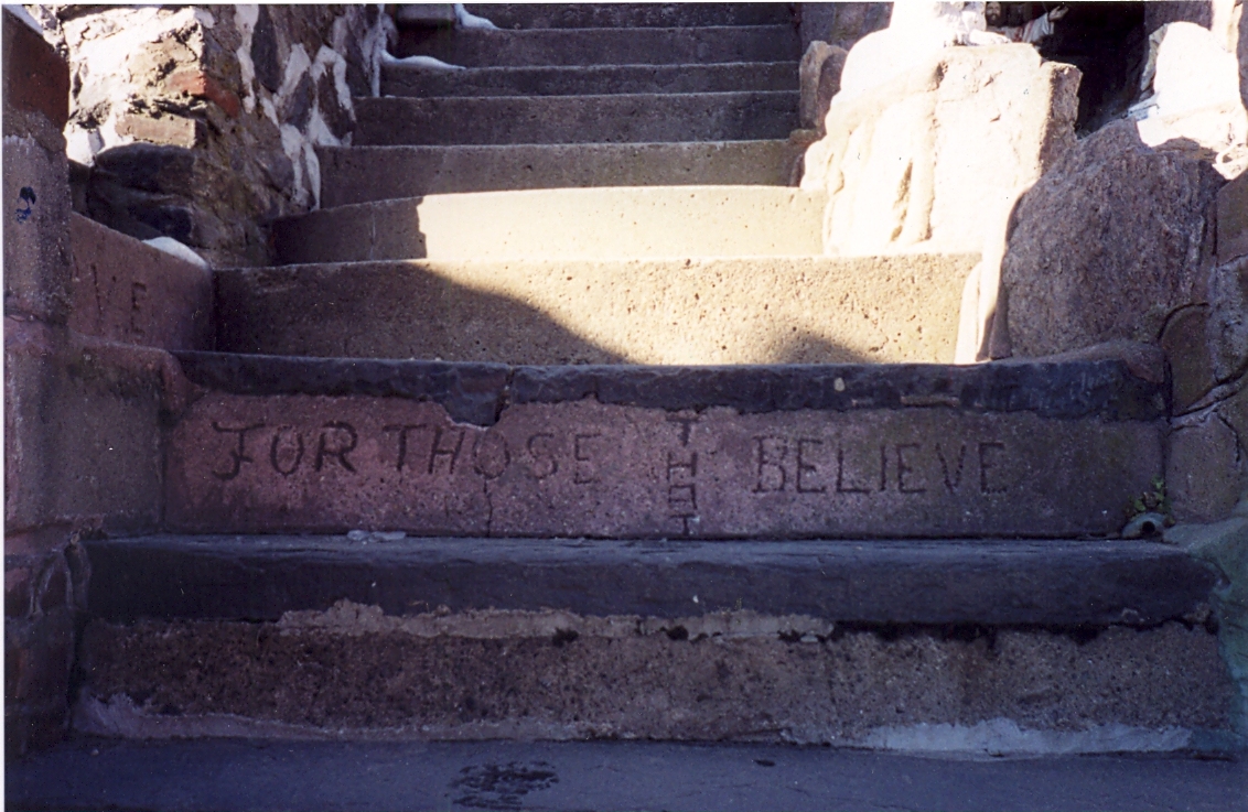
"FOR THOSE THAT BELIEVE"
Sadly, the Sanctuary might still be here had he charged admission. Here's a link to the pages from the book Weird New England, which has a brief article on the Sanctuary of Love and a scan of the New York Times article detailing the sad end of the Sanctuary of Love: the town of Norwich took the home due to some $60,000 in overdue property taxes and $40,000 in unpaid electricity bills. Sal kept living in the building for as long as possible, eventually moving into a nursing home after foreclosure proceedings began in 2000. He died of a stroke in 2004, at the age of 84, and made the national news one last time as an obituary and human-interest story. Here's another great article on Sal from CTMuseumQuest.com.
Suffice it to say, I think that Sal might be a more appropriate recipient of the label than two of the subjects I've written about recently (Emmanuel P. Gill and Genesis Breyer P-Orridge), as he had no real interest in making art, or even being recognized for his work. He was a humble, driven man who happened to make a beautiful, and meaningful, piece of art over the course of decades' worth of work.
As these photos from Flickr user Mike Z show, the site has been dismantled (everything that could be seen as valuable -- the statues, mainly -- was sold by the town of Norwich in 2002). The bathtubs and mosaics remain, and they're still beautiful, but needless to say it isn't the same without the statues of Mary, and the frail old man who loved her so much as to devote his life to building her a shrine.
More on Outsider Art soon. In the meantime, here's hoping that Eric Gearity's documentary on Sal and the Sanctuary of Love (documenting the last few years of Sal's life and his problems with the town of Norwich), gets aired and/or distributed via independent film channels.
Tuesday, March 9, 2010
Jack "The King of Comics" Kirby's costume designs
Thanks to Cambone on www.poe-news.com for pointing this out...
If you're reading a blog called "Culture High, Culture Low" (and let's be honest, you probably aren't), you hopefully share some of my interest in a wide range of artistic output. I don't really think there's a hard line dividing "high" and "low," and even if there is, I think it's really limiting to focus on one or the other. I'm a fan of ultra-cerebral modern and contemporary art as well as visceral pop culture like pop music, pro wrestling and, of course, comic books.
I'm also a big fan of artists working across the traditional lines of "high/low" culture and/or combining more than one form of art. A great example of this would be these costume designs for a 1969 production of Shakespeare's Julius Caesar, created by Jack Kirby, who is widely considered to be the most important and influential comic-book illustrator of the past 50 years at least.
The designs are classic Kirby, and are really only missing extreme foreshortening and some "Kirby Crackle" to complete the effect.


Much more information on this project (including many more drawings, several photos and the play's program) and many other aspects of Kirby's incredible contributions to popular culture can be found at The Kirby Museum...
If you're reading a blog called "Culture High, Culture Low" (and let's be honest, you probably aren't), you hopefully share some of my interest in a wide range of artistic output. I don't really think there's a hard line dividing "high" and "low," and even if there is, I think it's really limiting to focus on one or the other. I'm a fan of ultra-cerebral modern and contemporary art as well as visceral pop culture like pop music, pro wrestling and, of course, comic books.
I'm also a big fan of artists working across the traditional lines of "high/low" culture and/or combining more than one form of art. A great example of this would be these costume designs for a 1969 production of Shakespeare's Julius Caesar, created by Jack Kirby, who is widely considered to be the most important and influential comic-book illustrator of the past 50 years at least.
The designs are classic Kirby, and are really only missing extreme foreshortening and some "Kirby Crackle" to complete the effect.
Caesar in military garb, looking a lot like one of Kirby's "New Gods"
Roman field soldier - dig that stylized camouflage pattern!
Various Roman citizenry, including a fantastic Soothsayer
A very, VERY Kirby-looking Calpurnia
Calpurnia and the Maid give you a sense of how the designs translated into actual costumes.
Like a lot of comic fans of my generation (I first started reading them in the late 70s and it wasn't til the mid-80s that I became a full-on Comic Geek), my appreciation of Kirby was slow to build. I respected his contributions to comic history, but didn't see the majesty in his artwork until I was in my 20s. At that point, though, I completely fell in love with his costume designs, his dynamic page compositions, and the over-the-top mannerisms of his characters.
It's not for nothing that the easiest way for any contemporary comic artist to make a comic look like it was published in the sixties is to ape Kirby. Heck, it's still common for Marvel and DC to create blatantly Kirby-styled costumes for new massively-powered characters from deep space, or from godly realms like Asgard or Olympus. Essentially, the Jack Kirby costume aesthetic is shorthand for "major player" in comics, sixteen years after his death.
Tuesday, March 2, 2010
Fantastic diagram of Crayola color history
There's a symposium that I either just missed or am about to miss (I just can't afford the ticket or time this semester) hosted by Edward R. Tufte, the author of the classic design book The Visual Display of Quantitative Information. I'm a big fan of the book, and once I've got a bit more free time (read: once I'm certified and have a teaching gig), I fully intend to get the follow-up books.
Here's an example of the sort of thing Tufte talks about:

This diagram of the history of available colors in Crayola crayons just sets my left brain a-hummin'!
It's particularly interesting to look at the increased range of "skintone" colors in the late 50s...and also worth noting that the color "flesh" was renamed to "peach" in 1962. Nowadays, you can get a pack of various pinks, beiges and browns that can be used as skintones, but thankfully none of them is called "flesh," as that would pretty blatantly tell kids that that one color was the "right" color for skin.
Monday, March 1, 2010

Subscribe to:
Posts (Atom)


