Wednesday, December 29, 2010
Thursday, October 21, 2010
Back after a long while (and looking at photos of the subway)
I'm not very keen on the Metropolitan Transit Authority of late, but one of my points of local pride is the New York City subway system. It's eco-friendly, (relatively) economical (though the MTA is working to make that less the case), and a perfect illustration of the "melting pot" concept.
Really, I think that one of the things people from outside NYC or any other urban area need to understand about us is that the average outer-borough New Yorker spends at least an hour a day sitting next to strangers as part of a daily commute (on a sidenote, it's really weird for me to realize that, due to FINALLY GETTING A TEACHING JOB AND IT'S EVEN IN MY NEIGHBORHOOD as detailed below, an unlimited Metrocard would be a waste of money for me for the first time since they were introduced).
Allora (that's "anyhoo" in italiano), here's a link to a gallery of New York Times photos from the NYC subway system over the past hundred years. Around the late 50s, you start getting archtypal "Grey Lady" images; they're a nice reminder of the old aesthetic for photos at the Times. I must admit, it took me a while to warm up to their color photography, but by now I can't imagine the paper of the last decade without its incredible color photojournalism.
In other news:
- RIP Ari Up of the Slits (1962-2010) and General Johnson of the Chairmen of the Board (1943-2010). I'm sure that everyone who comes to this blog shares my love of scratchy post-punk and Carolina beach music, as well as art-education and site-specific artwork.
- Yes, this time I actually assumed that there ARE people who come here. Apparently, this blog now has two followers! And I don't even know you folks!
- I promise to get back into art-ed ramblings soon -- I just got hired as an art teacher at a middle school in the outer boroughs (!!!!), and need to find my footing with that age. If my principal is okay with it, I'll certainly post some images from projects as they develop, though I probably won't post the school's name or the kids' faces. Further reports as events warrant.
Wednesday, July 14, 2010
The Creativity Crisis (via Newsweek)
Here's a great article from the newest issue of Newsweek provides food for thought for those of us with kids, or who want to teach, or who care about art, or who care about America still generating great minds. Surely at least ONE of those criteria apply to you, right?
As Eliot Eisner and many other art-education advocates and theorists have noted, art education provides students with "Habits of Mind" (Eisner's term) which are not necessarily instilled through other, more academic -- and thus more typically privileged in a curriculum -- subjects. These habits encourage flexible, creative thinking, which benefits students not only in the art class, but in other classes and for the rest of their lives as members of society.
All fine and well for theorists to talk up the arts, of course, but this Newsweek article cites several scientific studies which show that creativity exercises (such as those found in a good art classroom) literally strengthen brain functions. It also states that American schools, and thus American adults, are falling behind Chinese and Asian schools in terms of creative thinking, which is hurting our industries and our ability to deal flexibly with important left-field issues as they arise.
Perhaps these are the angles from which to push for increased art-educational opportunities, in order to get the broadest coalition of supporters: science proves it and it's for the sake of our economy.
On a related note (and no, I am not saying that this project is exactly what America needs to regain its position at the top of the creative market), here are a few pictures of sculptures made by first-graders in response to a guided visualization I led them through while working as a student-teacher this spring. In the visualization, I had them imagine flying in a spaceship to the end of the universe, landing on a planet unlike anything Earthlings had ever seen, and meeting an alien from that planet. They then used homemade play-dough (which could be reformed - changing the shape) and found materials (which could be recontextualized - changing the meaning) to create the alien.

Sure, many of the aliens used similar materials - straws and toothpicks especially - but each student used them differently, and gave different explanations as to what the materials were. On one alien, toothpicks were poisonous spikes, on another, they were wind showing movement in a direction. One alien's snorkels were made with the same bendy straws as another alien's legs and the "laser sticky arms" of another. Each student was encouraged to create his or her own solutions, and find his or her own problems. American education needs more of that, not only from me (certainly not only from me!!) but from every teacher.

This alien is pretty much my favorite piece of student artwork ever - my cooperating teacher will vouch for me that I was all but in love with it. The student found a teapot lid in the box of found materials, and quickly realized that this wouldn't work as a stable base for a clay alien. His response was to make a mobile sculpture (it rolls in circles) with toothpicks, pipe cleaners and feathers reaching out in an arc which beautifully spins as the alien rolls. This six- or seven-year-old was thinking about kinetic movement and purposing his materials as intently as Alexander Calder did when making his early circus sculptures.
Anyhow, the Newsweek article makes a really good case for giving more students more access to the arts - visual, performative, musical, etc. Here's hoping that principals and parents read the article, so that it isn't just bouncing around the creative-arts-teacher echo chamber...
Saturday, July 10, 2010
"If you found ONE, they probably made a THOUSAND."

Your author would have looked just as stupid in this in 1991.
Pretty much everyone I know who lived in Brooklyn in the 90s fondly remembers Domsey's, a Williamsburg-Bridge-area clothing place legendary for its by-the-pound offerings in the basement. I found many staples of my ridiculous art-school-era "look" by sifting through piles of rags, ducking the bulldozers that were shoving bales of clothing, and pulling out the most gloriously weird stuff I found.
Nothing topped the mighty GRUNGE jersey, though.
A baseball jersey with an African-tricolor motif (red and yellow front panels, green sleeves, and a black back and hood), with five-inch-tall lettering spelling out the decidedly-not-Afrocentric word GRUNGE. It was the sort of thing a computer simulacrum would wear when it appeared to the United Nations, had it learned the ways of Earthlings entirely by watching VHS tapes of MTV from 1991. I found it around late 1999 or early 2000, long after it would have been timely in its misguided squareness.
The best thing about the jersey, other than it being hilariously ugly and uncool, was that it was produced by Spike Lee's short-lived 40 Acres and a Mule stores, themselves a time capsule of that period in the 90s when independent film still felt like something...well, independent. Unless the piece was a custom (not likely, given the price point of the 40A stuff when there was a store on Dekalb Avenue by Pratt), the GRUNGE jersey was a product which had been given the green light at least a few times between the drawing board and the coat hanger. I like to think that Spike Lee himself looked at the design on paper and said "Yes - this is exactly what I need to promote my brand as a vital aspect of Brooklyn Afrocentrism. Look out, Moshood!"
My wife (a costume designer who certainly knows her way around bulk clothiers) put it well: "The chances are, this was not a custom, and if you found one, they probably made a thousand of these."
Sadly, before I was able to finally wear it to a Spike Lee signing, I realized that it had been several years since I last wore it (and that I never even wore it in a promo photo for my late hip hop project, for which it would have been a perfect statement of my "it doesn't matter if you cheer my name or hiss me" persona). I ended up selling it to Beacon's Closet in Williamsburg about six months ago, and have since kinda-sorta expected to see it worn by some yahoo on Project Runway or in a band-promo photo in L Magazine.
I wonder if, ten years from now, I'll see a piece of clothing made in 2010 that so completely got 2010 wrong. Or am I now too old, too distanced from anything resembling the cool stuff? Would I even recognize square anymore?


Thursday, May 27, 2010
Brooklyn Friends School “Invents the Museum”
I've worked for several years as a pre-college instructor, teaching art and art history to high-school students. I've also spent the last two years working towards K-12 Art Ed certification, with the ideal goal of teaching high school students. As a true believer in teenagers' art, and a student of art education, I must say that the bar has been raised, both for high school art and for teaching high school art, courtesy of a show planned, produced and curated by the Brooklyn Friends School Art Club Cooperative and their teacher, Elizabeth Deull.
Before I go further, I should state that a) my wife is a teacher at Brooklyn Friends School; b) I've worked with several, but not all, of these students as a student teacher at BFS in the Fall 2009 semester; and c) I'm a recent graduate of the same art-education program as Ms. Deull, and have gotten to know her a bit at BFS over the past six months. As such, I'm not an unbiased observer - and I know that those few people who visit this blog expect nothing but the highest in journalistic integrity.
That said, this show of high-schoolers' work stands up aesthetically and conceptually to the majority of group shows in small commercial galleries in New York City. I'm very happy that it has been extended through June 6th, to coincide with the Atlantic Avenue Art Walk, and hope that it gets a lot of views and attention.
Okay, so let's talk a little bit about the art, shall we? In the words of the show's press release (here):
"In 'Invent the Museum' students chose to react to or reinvent an artwork or art idea that already existed in the world. This theme allowed students to research artworks of interest from a wide range of time periods, artists, artistic movements and media. They also learned about how artists and art movements from WWI to the present have developed new art ideas and expressions in reaction not only to the world around them, but often to the art that came before them. As a result, the student artists of The Art Club have constructed a show that presents their unique, contemporary take on both famous and more obscure artworks that span from the Renaissance to Postmodern times."

The show makes excellent use of a strange little storefront space on Hoyt Street in Brooklyn (half a block north of Atlantic Avenue) - the first thing you see walking by is a series of dolls made by the entire Art Club, each the familiar face of the Mona Lisa. It's a nice introduction to an exhibition that makes the viewer look at familiar artwork through the eyes of some of the newest acolytes to art history.
All of the work was impressively left-brainy for such young artists, and some pieces struck me as the equal of works from artists several years older and more experienced than these students. As I said above, this show stands up to most of what's up in group shows in NYC, and that's mighty impressive for a bunch of artists too young to legally vote.Here's what's on display:

Ashley Felix's linocut self-portrait (based on Egon Schiele's Self-Portrait with Hands Folded) makes explicit the sort of stance Warhol made with Gold Marilyn - by referencing classics from art history in the process of depicting herself, she's planting a flag in the long-running conversation of art.

please click this image to see it in its proper proportion!
Becky Grenham's painting perfectly states the tongue-in-cheek reframing of this exhibition's questioning of what gets to be considered a "classic" work of art, and why. Degas' dancer takes the floor at a discotheque, enjoying the attention of club kids rather than the stodgy folks who read about her in a copy of Janson's or the hoi polloi who know her as a calendar motif. Culture high, meet culture low. I love the colored dots showing the play of light off a disco ball – it implies movement and increases the tension between the figures and the flat black background, as well as making me think of Damien Hirst's "dot paintings."

Wiley Guillot has a great hand already - he draws beautifully and idiosyncratically, and that makes his response to Kiki Smith's work feel fully independent of his art historical reference (I mean that in the best way).


When I last saw Staver Klitgaard, she was immersing herself in painting, learning everything she could about how the Old Masters composed and produced their imagery. Her work in the show shows this exploration heading in a different direction: digital "painting reenactments" of herself and another Art Club member as figures from Picasso, Goya and Vermeer (I wonder how Picasso would feel to know that he's considered an Old Master by the newest crop of artists...I agree wholeheartedly, and Portrait of Olga dans un Fauteui is an excellent painting for a modern young woman to reenact).

Manos Lupissakis processes "traditional" graffiti, Banksy's stencils and wheatpastes, and the general aesthetic of peeling paint in the subway system to make an Ode to the Subway that I found worth poring over inch by inch.


Samantha Rees's wall of small pen-and-ink portraits comment on the emotional content of traditional portraiture, and use the wall beautifully and evocatively, while her Self-Portrait in the Style of Van Eyck suggests an amazingly diverse group of artists: Van Eyck, Kahlo, Klimt, Redon, even Stettheimer.
(this show ismuch more impressive than my ability to successfully format this blog entry...)


Amina Ross is well on her way as an artist already: her stunning modern interpretation of an African-American mourning quilt commands attention from the viewer, and her corner installation Defective Oracle made me chuckle for a moment, then ponder it for several days.

Nina Ryser adds collage and her own drawing style to reprocess the work of Keith Haring into something much more her own. This would fit right in at a Williamsburg gallery, and I'd love to see variations on the theme. I love the head and neck that haven't been painted in at all - it sets off the wood grain and collage nicely.

Romy Smith makes a statement similar to Ashley Felix's referencing of the Egon Schiele self-portrait, only with a lot more humor – her How Botticelli's Woman Got Her Groove Back subverts the Portrait of a Young Woman by styling the sitter more like 1980 than 1480. The model's smirk makes it clear that she's in on the joke.


Allie Shyer's installations, collages and assemblages process Schwitters and Cornell with a design sense that (in my eyes, your mileage may vary) echoes the presentation of jumbled, disconnected imagery on a Google image search (or maybe mid-career Richard Prince). I've seen a lot of her work by now, and it's all quite impressive.

The Art Club Cooperative is such not just in name: several other pieces in the room were produced in collaboration. The back windows of the small space are covered in marker-on-acetate (?) reproductions of classic self-portraits…

…hung over a shelf covered in plastic animals, all painted pink. My toddler LOVED that part.

There is also a wall of artworks made in the gallery by the Art Club members, all for sale at a measly $5 apiece. I bought two, and hope to buy a few more before the show ends. Money from the sales goes towards the Michael Nill Endowment Fund for Faculty Development, which will directly benefit Brooklyn Friends School and thus its students.
If you go, you really owe it to yourself to buy a piece of artwork. I can't wait to put mine up in my apartment once the show comes down (one of the ones I bought is the white panel with mounted 3-d black ribbon, visible under the appropriated picture of Wolverine. It's that kind of show.)

If you haven't been able to tell yet by reading my glowing praise, I'm very, very impressed with the caliber of artwork in this show, and by Ms. Deull's ability to work with students of this age to produce a show this impressive. I hope to get the chance to work with high schoolers again soon and will keep this show in mind as the exemplar of what can be done with talented high school students, provided that you give them a real, meaningful project to work on and push them to challenge their own limits.
"Invent the Museum" is up through June 6th (whether the BFS link at the top of this post says so or not) at 77B Hoyt Street between State Street and Atlantic Avenue, a space generously donated by the building owner, Nat Hendricks. Go see the show, wouldja?
Tuesday, May 4, 2010
B-Side wins again (Happy 73rd Birthday, Dick Dale!!)
If you can explain to me how a song this awesome could have been relegated to the B-side of a single, I'll owe you one.
Tuesday, April 27, 2010
Everything is relative (or, at least, color symbolism sure is)
Courtesy of Information Is Beautiful comes this amazing diagram(?) of the different meanings colors have various cultures around the world.

Click the link I gave above (or click it here if you demand instant gratification) to see a much larger, more legible version of the image. It's the final cover design for the book Information is Beautiful by David McLandess, which you can buy with this cover in the UK or with an inferior cover and title but the same text inside in the US.
Click the link I gave above (or click it here if you demand instant gratification) to see a much larger, more legible version of the image. It's the final cover design for the book Information is Beautiful by David McLandess, which you can buy with this cover in the UK or with an inferior cover and title but the same text inside in the US.
Tuesday, April 20, 2010
RIP: Keith "Guru" Elam (1966-2010)

43 years old. Hard to believe that Guru was able to get as much done for hip hop (and, let's be fair, for the popularization of jazz among Gen-X-and-younger African-Americans) as he did in such a short life.
Embedding on this blog doesn't work all that well. Here's a video of "Mass Appeal", my favorite Gang Starr track (or, well, one of the two or three dozen of my favorite Gang Starr tracks - I might have picked a totally different one if I'd posted this tomorrow). Click it and thrill to the man's voice. His rhymes were always good, but it was his voice that he'll be remembered for most.
RIP
Monday, April 12, 2010
My first experience with "Outsider Art"

Photos (circa winter 98-99) for this blog entry supplied by Jana Savanapridi of the Thunderfakers. Check out her music!
If I recall correctly, I first heard the term "outsider art" sometime in the early or mid-90s, while I was at Pratt Institute studying painting (and trying my damnedest to always be aware of "The Newest And Weirdest Shit"). It was likely around the time I first really studied Jean Debuffet -- he pretty much created the art-critical concept by coining the term "Art Brut" to describe artwork made by the institutionalized insane.
The term "Outsider Art" is essentially an Anglicization of "Art Brut," though in some people's minds it refers not only to the institutionalized but to anyone whose artwork exists outside of the standard studio-to-gallery-to-museum-with-a-general-knowledge-of-what's-going-on-in-art-history mode. That is to say, it's naive, and often a bit 'visionary' (much as I tend to avoid that term).
Aaaanyhow, when I first heard the term and had it explained to me, my reaction was "Oh. Like the Sanctuary of Love."


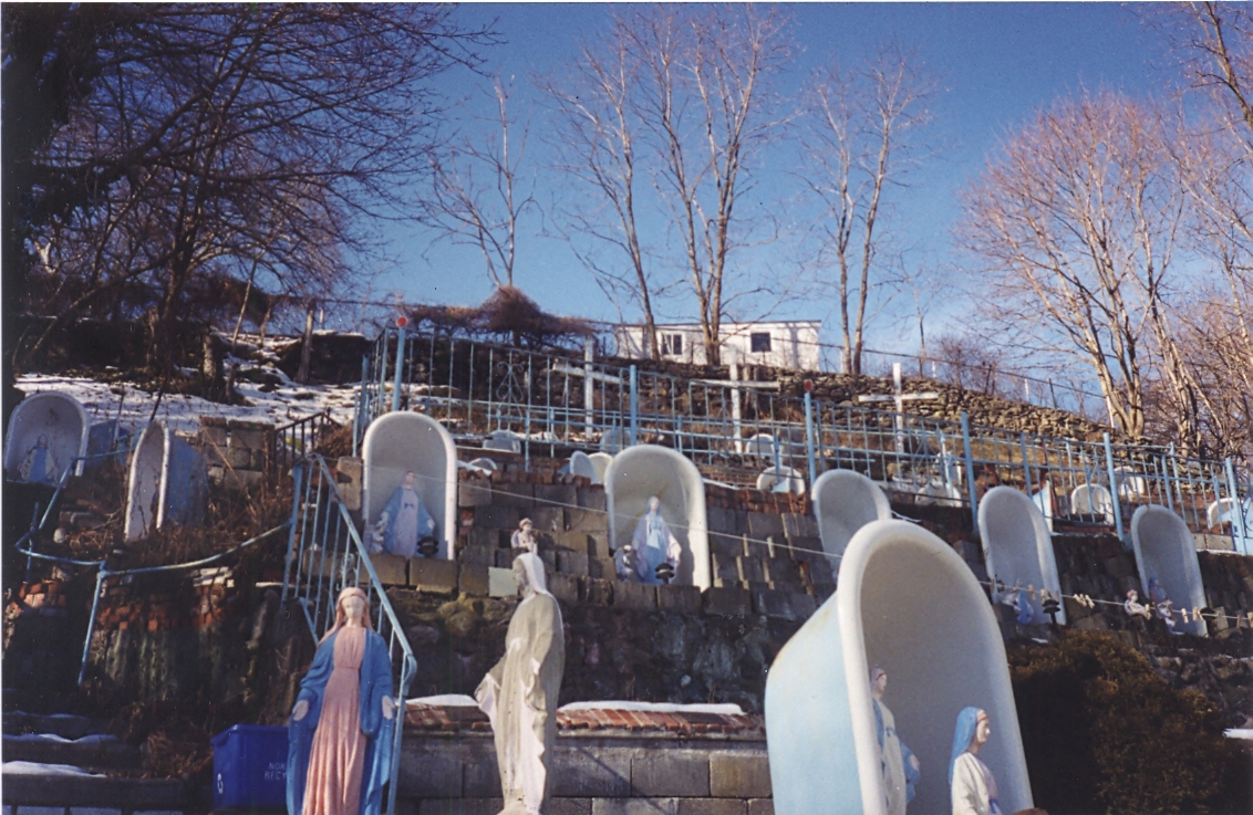
By "building," Sal meant decorating the steep incline of his building's backyard with forty-seven upturned clawfooted bathtubs, each home to a concrete statue of the Virgin Mary (he poured the concrete himself). Eventually, painted concrete seahorses and butterflies filled the yard as well. Three large wooden crosses stood near a stone wall carved with the Ten Commandments. The steps on the hill were filled with mosaics -- psalms and calls to prayer, a version of the Sea of Glass from the Book of Revelation, made of old broken glass from a nearby Thermos factory -- and eventually a lovely sign was posted on the steps leading up to the yard, reading, simply:
"WELCOME TO THE SANCTUARY OF LOVE. Your Faith Has Brought You Here."

The Sanctuary had a long run as a destination for the sort of Catholic who makes visits to shrines devoted to the Virgin of Guadalupe (or any statue that weeps blood, of course). In the 90s and early '00s, it became a place for those who'd lost money at the nearby casinoes to pray for luck at gambling (or for help after losing too much money). Sal never charged admission, and let needy people stay on the property for free, though there was a bucket in the back yard that people often dropped coins into.
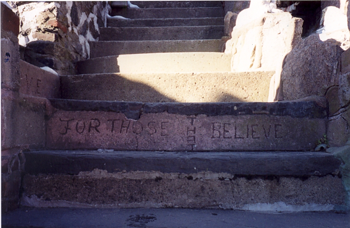
"FOR THOSE THAT BELIEVE"
Sadly, the Sanctuary might still be here had he charged admission. Here's a link to the pages from the book Weird New England, which has a brief article on the Sanctuary of Love and a scan of the New York Times article detailing the sad end of the Sanctuary of Love: the town of Norwich took the home due to some $60,000 in overdue property taxes and $40,000 in unpaid electricity bills. Sal kept living in the building for as long as possible, eventually moving into a nursing home after foreclosure proceedings began in 2000. He died of a stroke in 2004, at the age of 84, and made the national news one last time as an obituary and human-interest story. Here's another great article on Sal from CTMuseumQuest.com.
Suffice it to say, I think that Sal might be a more appropriate recipient of the label than two of the subjects I've written about recently (Emmanuel P. Gill and Genesis Breyer P-Orridge), as he had no real interest in making art, or even being recognized for his work. He was a humble, driven man who happened to make a beautiful, and meaningful, piece of art over the course of decades' worth of work.
As these photos from Flickr user Mike Z show, the site has been dismantled (everything that could be seen as valuable -- the statues, mainly -- was sold by the town of Norwich in 2002). The bathtubs and mosaics remain, and they're still beautiful, but needless to say it isn't the same without the statues of Mary, and the frail old man who loved her so much as to devote his life to building her a shrine.
More on Outsider Art soon. In the meantime, here's hoping that Eric Gearity's documentary on Sal and the Sanctuary of Love (documenting the last few years of Sal's life and his problems with the town of Norwich), gets aired and/or distributed via independent film channels.
Tuesday, March 9, 2010
Jack "The King of Comics" Kirby's costume designs
Thanks to Cambone on www.poe-news.com for pointing this out...
If you're reading a blog called "Culture High, Culture Low" (and let's be honest, you probably aren't), you hopefully share some of my interest in a wide range of artistic output. I don't really think there's a hard line dividing "high" and "low," and even if there is, I think it's really limiting to focus on one or the other. I'm a fan of ultra-cerebral modern and contemporary art as well as visceral pop culture like pop music, pro wrestling and, of course, comic books.
I'm also a big fan of artists working across the traditional lines of "high/low" culture and/or combining more than one form of art. A great example of this would be these costume designs for a 1969 production of Shakespeare's Julius Caesar, created by Jack Kirby, who is widely considered to be the most important and influential comic-book illustrator of the past 50 years at least.
The designs are classic Kirby, and are really only missing extreme foreshortening and some "Kirby Crackle" to complete the effect.


Much more information on this project (including many more drawings, several photos and the play's program) and many other aspects of Kirby's incredible contributions to popular culture can be found at The Kirby Museum...
If you're reading a blog called "Culture High, Culture Low" (and let's be honest, you probably aren't), you hopefully share some of my interest in a wide range of artistic output. I don't really think there's a hard line dividing "high" and "low," and even if there is, I think it's really limiting to focus on one or the other. I'm a fan of ultra-cerebral modern and contemporary art as well as visceral pop culture like pop music, pro wrestling and, of course, comic books.
I'm also a big fan of artists working across the traditional lines of "high/low" culture and/or combining more than one form of art. A great example of this would be these costume designs for a 1969 production of Shakespeare's Julius Caesar, created by Jack Kirby, who is widely considered to be the most important and influential comic-book illustrator of the past 50 years at least.
The designs are classic Kirby, and are really only missing extreme foreshortening and some "Kirby Crackle" to complete the effect.
Caesar in military garb, looking a lot like one of Kirby's "New Gods"
Roman field soldier - dig that stylized camouflage pattern!
Various Roman citizenry, including a fantastic Soothsayer
A very, VERY Kirby-looking Calpurnia
Calpurnia and the Maid give you a sense of how the designs translated into actual costumes.
Like a lot of comic fans of my generation (I first started reading them in the late 70s and it wasn't til the mid-80s that I became a full-on Comic Geek), my appreciation of Kirby was slow to build. I respected his contributions to comic history, but didn't see the majesty in his artwork until I was in my 20s. At that point, though, I completely fell in love with his costume designs, his dynamic page compositions, and the over-the-top mannerisms of his characters.
It's not for nothing that the easiest way for any contemporary comic artist to make a comic look like it was published in the sixties is to ape Kirby. Heck, it's still common for Marvel and DC to create blatantly Kirby-styled costumes for new massively-powered characters from deep space, or from godly realms like Asgard or Olympus. Essentially, the Jack Kirby costume aesthetic is shorthand for "major player" in comics, sixteen years after his death.
Tuesday, March 2, 2010
Fantastic diagram of Crayola color history
There's a symposium that I either just missed or am about to miss (I just can't afford the ticket or time this semester) hosted by Edward R. Tufte, the author of the classic design book The Visual Display of Quantitative Information. I'm a big fan of the book, and once I've got a bit more free time (read: once I'm certified and have a teaching gig), I fully intend to get the follow-up books.
Here's an example of the sort of thing Tufte talks about:

This diagram of the history of available colors in Crayola crayons just sets my left brain a-hummin'!
It's particularly interesting to look at the increased range of "skintone" colors in the late 50s...and also worth noting that the color "flesh" was renamed to "peach" in 1962. Nowadays, you can get a pack of various pinks, beiges and browns that can be used as skintones, but thankfully none of them is called "flesh," as that would pretty blatantly tell kids that that one color was the "right" color for skin.
Monday, March 1, 2010

Tuesday, February 23, 2010
RZA Crossing the Delaware (or "how to introduce irony to high-schoolers")
Irony is an unavoidable subject in discussion of contemporary art, but at times it's hard to explain to high schoolers in terms that they understand. My students so far have tended to love Warhol, Basquiat and Murakami, but they often don't recognize the references to art history that those artists made in much of their work. As such, an important aspect of the artists and their work is overlooked. Art teachers often just don't have the time to give full art-historical context to individual images they show their students.


Warhol's Gold Marilyn comes off as a lot gutsier when students know a little about Byzantine icons.
This isn't to say that students must have a full Janson's-textbook-worth of art historical knowledge to be able to appreciate irony and recontextualization in contemporary art. Kehinde Wiley's portraits of African-American youth in heroic poses, subvert Western tradition of representation in a way that's clear enough to adolescents. A teenager doesn't necessarily need to know about Salon painting to know that it's atypical for African-American youth to be represented on a field of fluer de lis.
Still, though - it's been over a decade since mainstream hip hop became the glammy, fashion-conscious, ultraconsumerist pop culture that it is now.

This image of Biggie Smalls is so glammy! That's completely out of character for hip hop...
Oh, wait.
As someone whose goal is to teach art history and studio art to high schoolers and/or middle schoolers, I try to keep an eye out for images of contemporary art that straddle the "high and low" divide, that use imagery so well-known to adolescents that the irony of their appropriation would be clear to everyone without needing to go back and explain what artwork the contemporary artist was riffing off of.
I've recently found a great example, which was posted online about a month and a half ago:
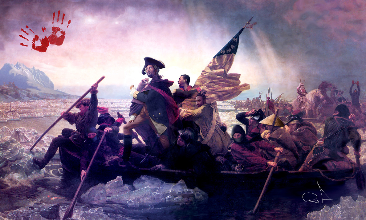
It's safe to assume that, at the very least, students have seen the Emanuel Leutze painting Washington Crossing the Delaware (1851) in a social studies textbook. They've probably seen it parodied in old Bugs Bunny cartoons. It's an ubiquitous piece of American culture.
And now it's been appropriated by the art collective When Art Imitates Life:
Yes, that IS the Wu-Tang Clan crossing the Delaware River, with ninja manning the oars.
This image is ridiculous. And it's awesome. It would be instantly recognized as the parody/appropriation/recontextualization/self-aggrandizement that it is, and could be used as a really great starting point for a discussion of other ironic appropriation of older forms (like Warhol and Wiley), or a discussion about how heroes are presented, or even about who gets to be called a hero.
My only concern is whether adolescent students consider Wu-Tang to be at all relevant anymore. These kids today, with their hippin' and their hoppin', they don't understand the classics like "Protect Yo' Neck."
Tuesday, February 16, 2010
Don't underestimate elementary-school art students!

(click the image to see it in a more legible size)
Behold: the patron saints of snarky pop-culture-critic bloggers
...as well as an early-ish example of a pop culture product beating its detractors to the punch.
Monday, January 18, 2010
"Every text creates its reader" - Umberto Eco

I haven't seen Avatar yet (movies just aren't worth paying a babysitter to take care of a toddler), but am marvelling at the inevitable "otherkin" reactions to the film. Some people online are claiming that they are (spiritually and metaphysically) Na'vi, the computer-animated furry amalgam of Native American and Southeast Asian stereotypes presented as the "noble savage" in the movie. There's even someone who's trying to create a "new Native American tribe" based on the Na'vi in Florida.
I've always been interested in personal statements from the insane and delusional, and over the last decade-and-change of access to the internet have found a lot of hilarious examples of group psychology, body dysmorphism and internet anonymity combining to create groups of people whose commonality is that they are all secretly something better than human - be it elves, dragons, mystical hermaphroditic foxes with butterfly wings, or now Na'vi.
What's greatest about watching this new group of "otherkin" emerge is that they're getting no love from the people who get together online to discuss how they're all elves or vampires or whathaveyou. Because, you see, Na'vi are fictional.
If this causes a huge internet meltdown with cries of 'persecution' and offensive attempts at identity politics which coopt the legitimate claims and identities of real-world minority groups, I will take back everything bad I've said about James Cameron since halfway through The Abyss.
Monday, January 4, 2010
DIY Publishing: Zines and Comix
Here's a video that I made with Lisanne McTernan for Rebecca Bourgault's Diverse Classrooms in a Visual Culture class this past semester:
(WARNING: naughty language, naughty drawings, and beer-drinking appear, so maybe you don't want to view this at work if that's an issue there)
It was a lot of fun meeting and talking to all of the interviewees, and I'm pretty happy with the final product (which took way too long to edit, but which piqued my interest in doing more video work later). One of these days, once my schedule and finances allow it, I am going to get off my ass and attend the Comic Jam again with the goal of having a beer, making obscure comic-book references and drawing goofy jokes, rather than filming people doing the same.
It was a lot of fun meeting and talking to all of the interviewees, and I'm pretty happy with the final product (which took way too long to edit, but which piqued my interest in doing more video work later). One of these days, once my schedule and finances allow it, I am going to get off my ass and attend the Comic Jam again with the goal of having a beer, making obscure comic-book references and drawing goofy jokes, rather than filming people doing the same.
Sunday, January 3, 2010
Vic Chesnutt, 1964-2009

R.I.P., Vic, and thanks so much for all the music. I'm sorry that it got so difficult for you.
Subscribe to:
Posts (Atom)


